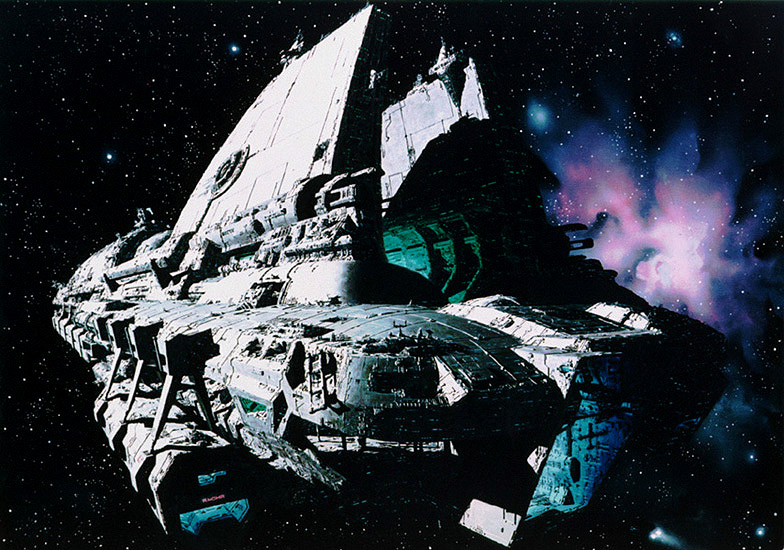
Thought I'd share this pic I did a while back, it was intended to set the tone and 'vision' for the project, no doubt old and obsolete now... It was included in Warren's public presentation at last year's unveiling event in London so I think it's fair to post. The title font was just temp of course..
Subscribe to:
Post Comments (Atom)


2 comments:
This is truly inspiring - beautiful work! :)
Awesome work! Keep it up!
Also, did you get my email? about Trespasser? ZamCo@live.se
/ Marcus Lindstrom
Post a Comment